Standard Goods
HOW CAN AN E-COMMERCE WEBSITE ENHANCE THE EXPERIENCE OF A NEIGHBORHOOD BOUTIQUE?
Small local businesses are what makes Seattle neighborhoods great places to live and work, and Standard Goods is no exception. However, the Standard Goods website lacks the clear organization and product details necessary for an intuitive online shopping experience. This proposed redesign builds upon the curated, unique feel of the brick-and-mortar store. It creates an avenue for customers to easily purchase items they saw in the store, discover new items, and stay on top of seasonal events and promotions.

SETTING
General Assembly
User Experience Design Immersive
2 week sprint
ROLE
lead designer
TOOLS
hand sketching
omnigraffle
invision
DELIVERABLES
clickable website prototype
PROJECT PROMPT
AND BACKGROUND
Given: a website, a persona, some business goals.
Design a clickable prototype for an online shopping experience. The design should align with the goals of the user(s), the goals of the business, and the brand of the physical store.
- connection back to the brick and mortar store. (brand, feel, but also ease of shopping experience)
- difficult to find items or browse intelligently
- no reviews or other social validation for items
- no product details for featured items on the homepage
- lack of sub-categorization or filters
UX OBJECTIVES

SITE NAVIGATION
Make it easy to find items, browse intelligently, and discover store events

BRAND RECOGNITION
Connect the website experience with the look and feel of the in-store experience

ITEM CONTEXT
Provide product and brand details, connect to reviews and other social validation
Ready to shop? View the interactive prototype here:
note: This prototype was built to showcase one flow through the app, consistent with the user flow and scenario. Affordances are highlighted in blue to indicate the live links, click to navigate through the prototype.
USER ANALYSIS
AND PERSONA
I was provided a persona by General Assembly as a starting point for this project.
persona summary
- art teacher, appreciates good design
- enjoys spending time with his daughter (12 yo) — always looking for activities and experiences.
- appreciates quality brands — needs social proof of ‘cool factor’
- online shopping needs: easy checkout, easy returns, ability to search for and find what he wants, ability to see what others think about the product.
BUSINESS ANALYSIS
AND GOALS
Business summary
Standard Goods is a ‘creative classic contemporary lifestyle boutique in the heart of Capitol Hill’. They have a great brick-and-mortar presence, but would like to increase their online sales. They are not only a retail store, but also have showings of local artists and participate in community events (art walks, block parties, etc. )
business goals
Goals of the website redesign include increasing online sales by 5%, bringing more customer browsing to sales completion, and attracting and retaining a loyal customer base (repeat customers). The website should also act as a complement to the physical store — both in look and feel and in shopping experience.
current category page on the standard goods website
wEBSITE REQUIREMENTS (given)
- must have a means for a shopping cart
- meaningful categories of products
- product detail page.
Website Redesign focus areas
- connection back to the brick and mortar store. (brand, feel, but also ease of shopping experience)
- difficult to find items or browse intelligently
- no reviews or other social validation for items
- no product details for featured items on the homepage
- lack of sub-categorization or filters
COMPARATIVE AND
COMPETITIVE
ANALYSIS

filson
- clearly organized categories, predictable.
- emphasis on the product as object, which is named.
- heritage and longevity — no sale items.

e smith mercantile
- site is geared to get people to the physical store, and there is an emphasis on the lifestyle narrative.
- feeling of site is very environmental and event-oriented.
- shopping is secondary, as more of an inventory.

uncommon goods
- unique items in unique categories.
- emphasis on ‘gifts’
- inventory is categorized by person and also by price.
- there is a registry.
USER SCENARIO
AND STORYBOARD
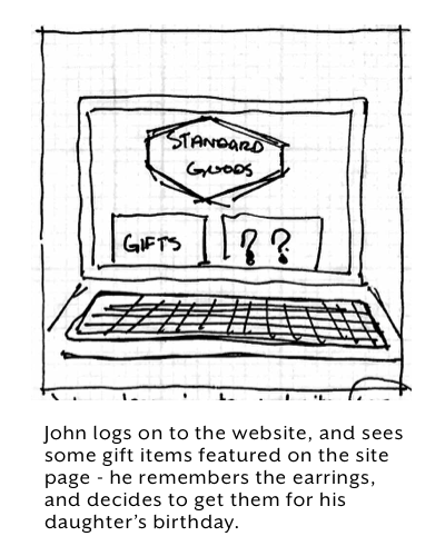
I developed a scenario for my user and illustrated it through a storyboard to help me get into my user's head.


SITE MAP AND
USER FLOW
The user flow incorporates both the in-store experience and the online experience.
click to enlarge and see full flow
The proposed site map re-organizes the inventory with fewer categories, relying on sub-categories and filters to find items quickly and browse intelligently.

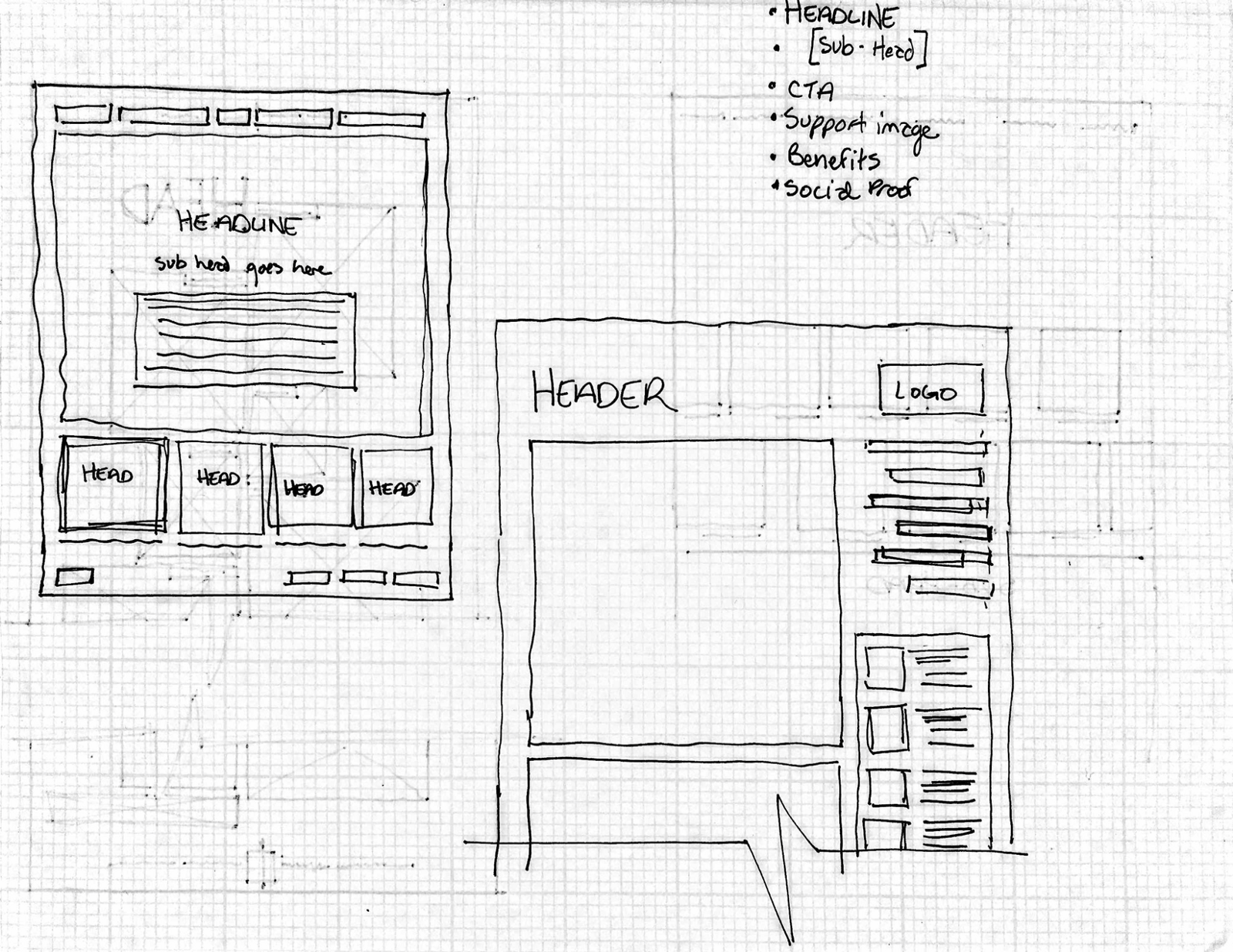
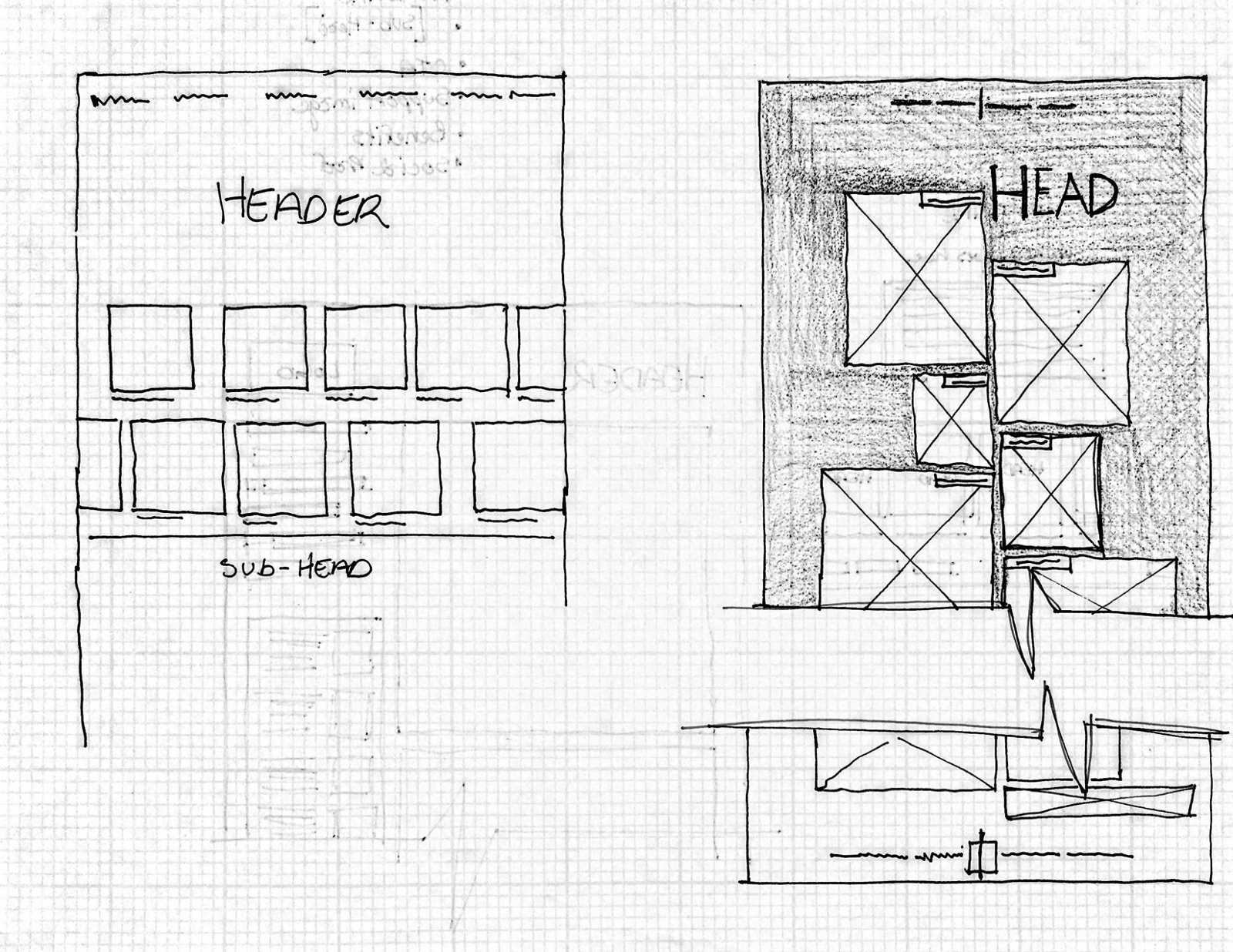
SKETCHES
I began sketching key pages by hand, testing page layout and UI for interaction design.

ITERATING AND
USER TESTING
I brought wireframes into Omnigraffle, and used Invision to user test the design.
I conducted several rounds of user testing and got great feedback, even though my wireframes were preliminary. The feedback helped me to focus what parts of my site design were most critical to develop:
- The checkout process: but feedback indicated that thought it was improved, it was too lengthy and confusing.
- Make sure that at every stage of the ‘browsing’, users are given easy ways to back out of the path they have taken — conventional x’s out of windows and breadcrumbs.
- Make sure to consider the layout as it will appear on the screen — what is above and below the fold? If there is a header, and especially if it is sticky, how much real estate is it taking up on the page? Is it getting in the way of seeing content?
evolution of the product page, based on user feedback:
WIREFRAMES
The primary design changes come from the business needs and the user’s needs. The aesthetic of the site has gone cleaner and more minimal, and reflects the curation of Standard Good’s inventory.
note: This prototype was built to showcase one flow through the app, consistent with the user flow and scenario. Affordances are highlighted in blue to indicate the live links, click to navigate through the prototype.
SITE PAGE
When John logs on to the Standard Goods website, he is brought to the site page which features a prominent expanded header with clear navigation and a few featured items.
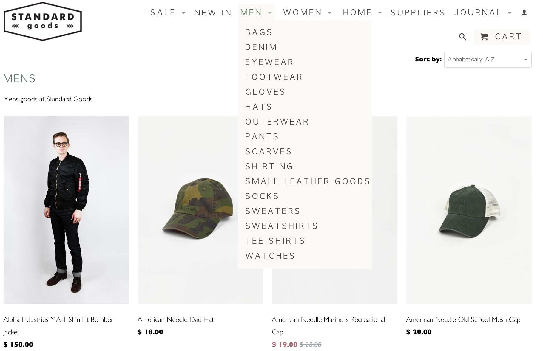
category page
The category page features a smaller header than the site page to give more space to the products. Product image size is standardized. Filters have been added via a lightbox, and when the window collapses the categories chosen remain visible. On each item, it is clear what the name and manufacturer is. An item number has also been added, both for the customers and the business to keep track of items.
Item page
The item page has been updated with several key items based upon user desires: multiple large images, ability to post and read reviews, links to where this item may have been highlighted in the media, and information about the item and the manufacturer. The page layout gives the user quick access to essential information and ‘add to cart’.
Checkout
The user is invited to keep shopping or continue to checkout from the ‘add to cart’ lightbox. Once in the checkout process, the interface becomes much more streamlined. Buttons for next steps are near the top of the page, and there are fewer pages than the original site had.